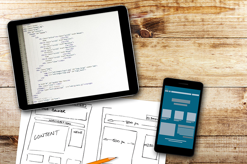
Have you crossed all your “website must-haves” off your startup’s checklist? Is it user-friendly, with engaging content and links to your social media profiles? Don’t forget one of the most crucial steps: making sure it’s optimized for mobile devices.
Now that an astounding 80% of cellphone users go on the web to search for products and services, it’s time to sit up and get your site ready for mobile. An article from The Next Web expounds on the importance of mobile responsiveness for your website but basically, if your website looks great on a desktop, it’s equally important that it works just as well when a user is on a tablet or a cellphone.
The Difference Between Mobile Users And Desktop Users
Screen size isn’t the only thing that sets mobile users and desktop users apart. Most mobile users have different goals and prefer data in easily consumed parts. Many surveys report impulse buys are much more common on mobile websites and that these same users spend more than those on desktop sites.
This emphasizes how important it is to provide the best mobile experience. Making it easier to contact you or purchase from your site using a mobile device will make users more likely to return to your site. But these aren’t the only reasons why you should be making your website mobile-ready.
Rank High With A Mobile Ready Website
Google regularly adjusts its search algorithm and it currently includes “mobile friendliness”. This means that if your website is optimized for mobile, you’ll rank higher than those that don’t. It’s important that you’re aware of how these changes could affect your search ranking. Google states that it now includes more mobile-friendly websites in its search results to make sure that users can access sites regardless of what device they’re using.

Before making sure that your website is optimized for mobile, it’s important that you understand how your current mobile website operates. Place yourself in your customer’s shoes and go through your website, asking yourself these questions:
- Are you satisfied with how the website looks?
- Does it load in three seconds or less?
- Is navigating the website simple and straightforward?
- Is text easy to read?
- Are you able to go to different pages and easily look at every part of the site?
- Can you easily recognize and click on the call to action?
- Do menus and search bars appear natural?
- Does the website fit well inside the screen?
- Does it offer a generally positive user experience?
- Would you use that website if it wasn’t your own?
If you answer negatively to any of the previous questions, it’s time to overhaul your current mobile website. Many companies understand how crucial it is to have an online presence but it’s now just as important to have an optimized mobile website.
Having a mobile-ready website developed for your startup or small business doesn’t have to break the bank. Learn more about our membership package here.